NEoN catch up with Monica Studer and Christoph van den Berg
Monica Studer and Christoph van den Berg are an artistic duo based in Switzerland who use computer generated graphics to create virtual and physical environments. NEoN spoke to them about their practice and plans to bring an interactive installation to Dundee.
What attracts you to computer generated images, and how random is your process?
It is probably more the 3D objects underlying the images we are attracted to. Basically, we look at the world’s things by making models of them. Objects, spaces, words, music… It is one possible artistic strategy in computer art to recreate stuff and find out about the differences between the physical and the digital.
If you look at our big prints or installations you will find that we are not searching for photographic similarity; we like to leave traces and hints suggesting that the CGI imagery is not found but made. When refining 3D models or spaces, we stop working at a certain stage of “noticeable imperfection” that, in traditional art categories, could be attributed to Realism rather than to Naturalism.
In that regard, our 3D design process is mostly wilful and not random. Random selection comes into play when we put the models in the game engine. The objects you see are taken by the program at random from script definitions; what we get to see in the projection is the perpetual change of combinations of the object protagonists in realtime, leading to new and surprising variations and arrangements every time we watch it.
However, the range of how many random decisions we use in our projects goes from not at all to entirely random-based, according to what we intend to do.
What 3D imaging software do you use on a regular basis?
Most of the time we work with common user software. For modelling and rendering we use Cinema 4D and Bryce, although sometimes we have to write plugins (you don’t find decent 3D boulders in the standard programs, for instance, so if you want the perfect piece of rock you have to write a program). For plants and trees we use Onyx, and we use a Japanese software called Pepakura for – take a guess – papercraft modelling from 3D data.
Most of our models, textures, and shaders are made from scratch, as we mostly are not satisfied with the models you can download from the net.
The interactive end of the 3D production line, like the game engine for the ‘Passage Park’ projections, is written in a simple Basic dialect for controlling DirectX. We have been using this for the last decade, which is ages in the digital era. However, it is very robust and reliable (it does what we want) and can be implemented in installations with very low effort and cost (it does what the commissioners want).
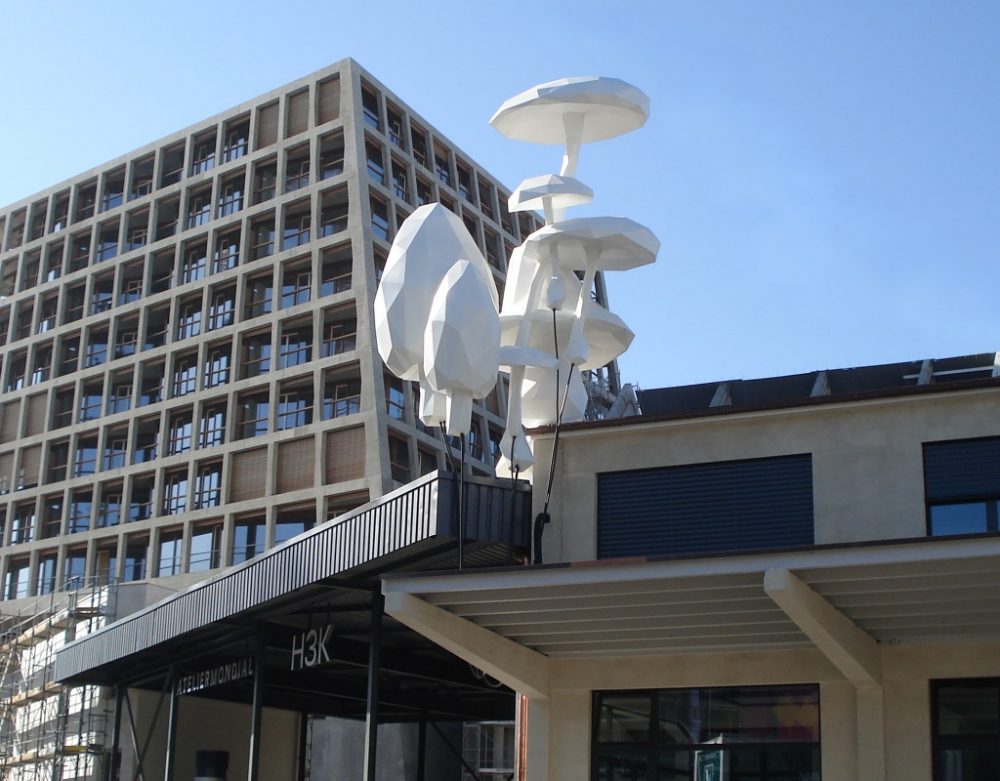
How do ideas of architecture influence your work?
The spaces we live in are organized by built structures both physically and in our digital environment. The way we look at things, move within and between them, and think about them relates to interventions certain people – builders, politicians, architects, urban planners, gardeners, but also software and system engineers etc – have decided for us. Even landscapes, which can look very natural and untouched, are designed according to someone’s ideas. Moreover, all this is not in a static arrangement; it is constantly modified and updated to meet what has been negotiated/dictated by public agents and new technologies.
Our image of this space around us is shifting, too, especially the map representations of it. While we grew up using paper maps and city plans for orientation, the digital versions we carry along on our phones are much more helpful to find a remote pottery shop in a hidden cul-de-sac in a Tokyo suburb. We tend to rely on Google Maps and the satnav rather than on road signs and the directions given by some bloke in the street, and some of us become helpless when marooned in an urban site without a phone.
As artists, we reflect our living in these structures. For this, we often “fake” built-up sets by building digital versions of them – fictitious twins. Like when you meet a sibling of an intimate person and find a familiar nose or a typical twitch of the shoulders, you recognize parts of the display and you start comparing. The sets we create are fictitious and sometimes rather cliché; still they should be easily recognizable to make the similarities and differences visible.
In some projects we look for such simple images as a starting point for the content debate. A scantily timbered shack tells another story than a hotel or an airport. However, we are not depicting “good” or systemical architecture, even though we are very fond of open process and utopian thinking in architecture. Instead, we would like people to have an easy access to the spaces we offer in our installations.
Do you think it is possible to recreate more sublime aspects of nature within a digital landscape, if not do you think it could be possible soon?
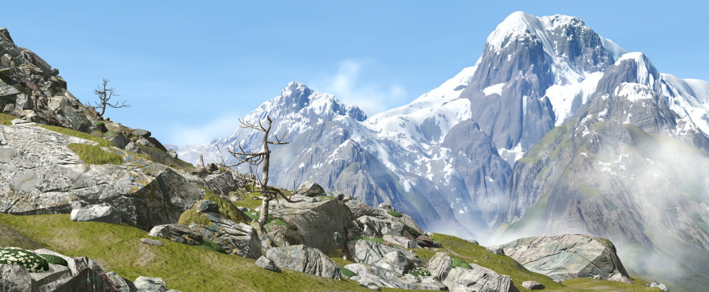
The landscapes in our installations are idealized lookalikes, and not what you find in reality (even though we remember having a big print in an exhibition, where a visitor absolutely insisted on having climbed on one of the fake peaks shown in the digital Alpine scenery). It’s not new though; painting, poetry and representations collected and refined by viewing through technical media have always tended to emphasize the sublime in a landscape. But while getting closer to the pinpoint of sublimity with digital images is not a question of a more sophisticated software or better skills of the artist tech to reach more complex representations, the upcoming techniques for immersion or AR on the other hand will change the experience of these images. Still, we should not mistake the stunning effect of being right within a set with a display headset for the sublime aspects of an image. After all, it is the artist’s view on the landscape and their purposeful expression that makes the image material reach beyond any random mobile snap.
What have you got planned for NEoN?
There will be an installation called ‘A Hotspot Shack’, a small accessible construction. It was first shown and commissioned by the Helvetia Art Foyer in Basel, Switzerland, in 2016. Its outside walls are covered with wallpaper prints that form a small living space, a fictitious temporary accommodation. While this metaphor can be found in the narrations of many computer games, huts and sheds are found everywhere on the planet in local materials and shapes. Whether they are cobbled together with replacements or bought as prefab modules, they offer small spaces for all basic needs – still, there is always something improvised and ephemeral to them.
Inside the dark space we have ‘Passage Park #4’, the interactive projection described above. On the projection screen, 3D objects and photographs are floating around in an open space; they are constantly arranged at random by our software. The ‘Passage Park’ projection has several stages, for ‘A Hotspot Shack’ we have expanded the object library with new elements related to the inside/outside theme of the installation, including scaffolds, construction sites, curtains, and of course parts of the shack itself.
In addition, we have been invited to do a series of 16 posters for the public art project ‘Sharing not Hoarding’. There will be a view into an artificial landscape, with one or two small surprizes. We don’t want to tell too much for the moment, but it will be fun.
Interview conducted by Ana Hine.
